FlexBox - A new way to layout elements in CSS
Let's learn the FlexBox from Scratch.
What is Flexbox?
Flexbox is a complete module, a way to design layouts in CSS very quickly and effectively. It is broken into two parts:
- Flexbox Container: It is a parent element where we define all properties of flexbox layouts.
- Flexbox Items: All items inside the flexbox container are called flexbox items.

Flexbox Layout

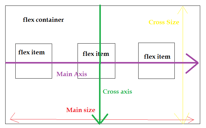
By default, the main axis goes horizontally and cross axis goes vertically. Firstly, we will see how to layout using the main axis.
1. justify-content
a. flex-start(default)
Using this property, all the flex items shift towards the left side of the main axis. This is also the default property of justify-content.
Syntax
.flexbox-container{
display:flex;
justify-content:flex-start;
}

b. flex-end
Using this property, all the flex items shift towards the right end of the main axis.
Syntax
.flexbox-container{
display:flex;
justify-content:flex-end;
}

c. center
Using this property, all the flex items shift towards the center of the main axis.
Syntax
.flexbox-container{
display:flex;
justify-content:center;
}

d. space-between
Using this property, all the flex items get spread across the main axis with equal space between each two individual flex items and occpy complete space of the container.
Syntax
.flexbox-container{
display:flex;
justify-content:space-between;
}

e. space-around
This property is similar to space between but it adds not only between the flex items but also the space on the starting of the container and first item and end of the container and last item.
Syntax
.flexbox-container{
display:flex;
justify-content:space-around;
}
 The amount of space in starting and ending of the container is half the space between the flex items.
f. space-evenly
This property is similar to the space around but the space distributed here with containers and items are same as the space between the flex items. Syntax
.flexbox-container{
display:flex;
justify-content:space-evenly;
}

2. align-items
With this property, now flex items are arranged with respect to the cross axis.
To show it pictorially, we will use different heights of flex elements.
.elements{
width:20%;
}
.elements:nth-child(1){
    height: 150px;
}
.elements:nth-child(2){
    height: 200px;
}
.elements:nth-child(3){
    height: 250px;
}

a. stretch
I changed the height of the first element to height=initial which means I have removed the height of the first element. With stretch property, the first elements will extend its full height as much as content space is given. But the second element's height is fixed so it is not stretching.
Syntax
.flexbox-container{
display:flex;
align-items:stretch;
}


.elements:nth-child(1){
    height: initial;
}
.elements:nth-child(2){
    height: 200px;
}
.elements:nth-child(3){
    height: 250px;
}

b. flex-start
It is similar to the flex-start of justify-content but the axis is changed. Here, flex items get arranged at the top of the cross axis.
Syntax
.flexbox-container{
display:flex;
align-items:flex-start;
}
c. flex-end
It is similar to the flex-endof justify-content but the axis is changed. Here, flex items get arranged at the bottom of the cross axis.
Syntax
.flexbox-container{
display:flex;
align-items:flex-end;
}

d. center
It is similar to the center of justify-content but the axis is changed. Here, flex items get arranged at the center of the cross axis.
Syntax
.flexbox-container{
display:flex;
align-items:flex-center;
}

3. flex-direction
This property determines the direction of axis, i.e main axis needs to be horizontal axis or vertical axis and vice versa. By default, the flex-direction is row i.e items arranged with the main axis (horizontally).
a. row(default)
Flex-items are arranged horizontally on main axis by default using this property. Syntax:
.container{
    display: flex;
    align-items: flex-start;
    justify-content: flex-start;
    flex-direction: row;
    height: 500px;
}

b. row-reverse
Flex-items are arranged horizontally on the main axis but instead of left to right, now they are arranged from right to left. Syntax:
.container{
    display: flex;
    align-items: flex-start;
    justify-content: flex-start;
    flex-direction: row-reverse;
    height: 500px;
}

c. column
Flex-items are arranged verticallyon the main axis from top to bottom using this property. Syntax:
.container{
    display: flex;
    align-items: flex-start;
    justify-content: flex-start;
    flex-direction: column;
    height: 500px;
}

d.column-reverse
Flex-items are arranged vertically on the main axis from top to bottom using this property. Syntax:
.container{
    display: flex;
    align-items: flex-start;
    justify-content: flex-start;
    flex-direction: column-reverse;
    height: 500px;
}

4. align-self
All the properties that we have discussed earlier, are used to layout the flex container but this property is used to layout flex items specifically.
Syntax
.elements:nth-child(1){
    height: 20%;
    align-self: flex-start;
}
.elements:nth-child(2){
    height: 30%;
    align-self: flex-end;
}
.elements:nth-child(3){
    height: 40%;
    align-self: center;
}

5. Sizing flex items
Using these properties, we can easily size the flex items. This is done with flex-grow, flex-shrink, and flex-basis.
a. flex-grow
This property applied on flex item and it defines that how much extra space that flex item needs to fill the container.
Syntax
box{
  width:200px;
  height:200px;
  background: brown;
  margin: 0 1em;
/*   flex-grow:1; */
}
Before applying flex-grow, the boxes were fitted like this. They aren't taking the space left beside them to fill the container.

After applying the property flex-grow on item, it looks like this.

b. flex-shrink
If any flex-item sizes get increased more than their container then using this property, the items get shrink to fit the container.
.box{
  width:100px;
  height:100px;
  list-style:none;
  border: 2px solid black;
  text-align:center;
  background:green;
  color:white;
  font-size:2rem;
  flex-basis:150px;
  flex-grow:1;
}

.box1{
  flex-shrink:5;
}
Here, all the boxes will grow at the same pace but at the time of shink( means as I reduce the size of the screen), the width of the first box decrease at a faster rate than the others.
Before applying flex-shrink to the first box, the image looks like this

After applying the property and reducing the size of the window, it will look like

c. flex-basis
This property is used to specify the initial length of the flex item. It works similarly to max-width.
flex-basis:150px:


The size of the boxes will not exceed more than 150px.
Huff, I hope you like it , it was lengthy and if this blog added any value to your knowledge, my work is done .

